# Define specific colors (same as CSS from quarto vapor theme)
background = '#1b133a'
pink = '#ea39b8'
purple = '#6f42c1'
blue = '#32fbe2'Introduction
Regression, a fundamental concept in machine learning, enables us to model relationships between variables. Whether predicting house prices based on square footage or analyzing the impact of advertising spend on sales, regression plays a pivotal role in understanding and predicting patterns in data.
Data Visualization
I use the following colors in all of my blogs data visualizations
I will use the following plot_scatter function to create the data visualizations on this page
import matplotlib.pyplot as plt

def plot_scatter(X, X_Range, ax_plot, title):
  fig, ax = plt.subplots()
  scatter = ax.scatter(X, y, color=blue, edgecolor='black', alpha=0.6)
  ax.plot(X_Range, ax_plot, color=purple, linewidth=2)
  ax.set_title(title, color=purple)
  ax.set_xlabel('Feature', color=blue)
  ax.set_ylabel('Target', color=blue)
  ax.grid(True, linestyle='--', alpha=0.5)
  ax.tick_params(axis='x', colors=blue)
  ax.tick_params(axis='y', colors=blue)
  ax.set_facecolor(pink)
  fig.set_facecolor(background)
  plt.show()
Linear Regression
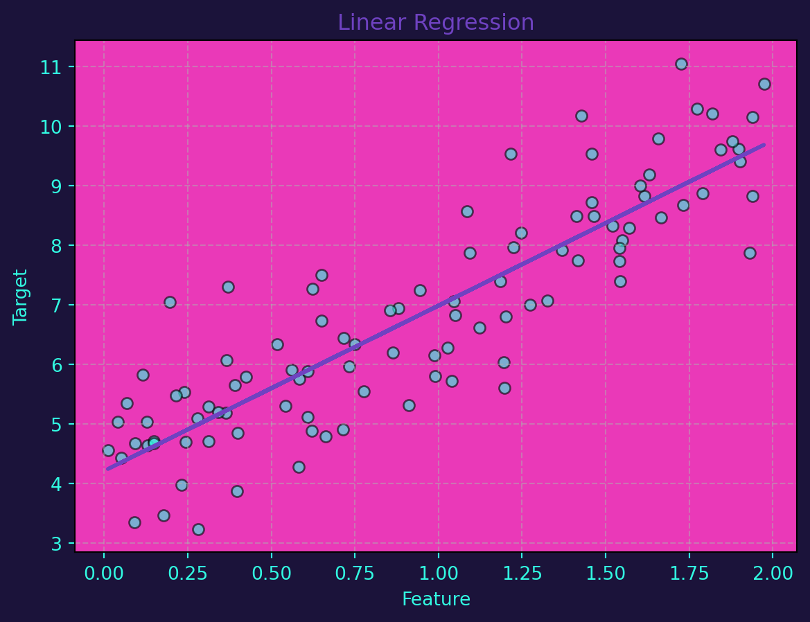
Linear regression is a straightforward method for modeling linear relationships between variables. In a simple linear regression model, the relationship is expressed as \(y=mx+b\) where \(y\) is the target variable, \(x\) is the feature, \(m\) is the slope, and \(b\) is the intercept. For multiple features, the equation becomes a linear combination.
Linear regression can be implemented effortlessly using Python’s scikit-learn library. Let’s generate a synthetic dataset and visualize the linear regression line:
import numpy as np
from sklearn.linear_model import LinearRegression

# Generate synthetic linear data
np.random.seed(42)
X = 2 * np.random.rand(100, 1)
y = 4 + 3 * X + np.random.randn(100, 1)

# Train linear regression model
linear_reg = LinearRegression()
linear_reg.fit(X, y)

# Visualize the linear regression line
ax_plot = linear_reg.predict(X)
plot_scatter(X, X, ax_plot, 'Linear Regression')
Nonlinear Regression
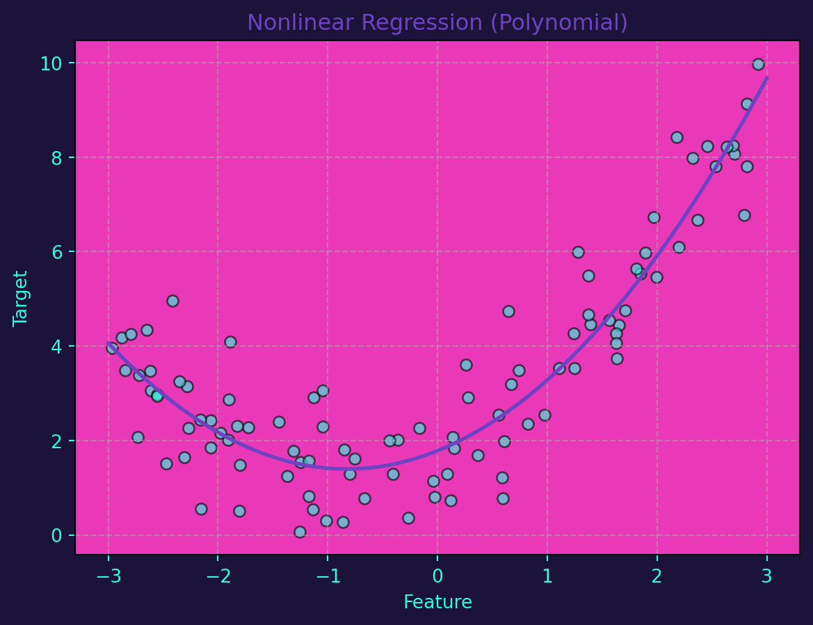
While linear regression is powerful, not all relationships are linear. Nonlinear regression extends the concept by accommodating more complex patterns. Polynomial regression is a common technique, where the relationship between variables is expressed as a polynomial equation.
Let’s use Python to implement nonlinear regression through polynomial regression. This time, we’ll generate a synthetic dataset with a nonlinear relationship:
from sklearn.preprocessing import PolynomialFeatures
from sklearn.linear_model import LinearRegression
from sklearn.pipeline import make_pipeline

# Generate synthetic nonlinear data
np.random.seed(42)
X = 6 * np.random.rand(100, 1) - 3
y = 0.5 * X**2 + X + 2 + np.random.randn(100, 1)

# Train nonlinear regression model (polynomial regression)
degree = 2
poly_reg = make_pipeline(PolynomialFeatures(degree), LinearRegression())
poly_reg.fit(X, y)

# Visualize the nonlinear regression curve
X_range = np.linspace(-3, 3, 100).reshape(-1, 1)
ax_plot =  poly_reg.predict(X_range)
plot_scatter(X, X_range, ax_plot, 'Nonlinear Regression (Polynomial)')
The power of regression becomes evident when we visualize the results. Scatter plots with regression lines or curves help us understand how well the model captures the underlying patterns in the data.
In conclusion, linear and nonlinear regression are indispensable tools in the machine learning toolbox. While linear regression is effective for simple relationships, nonlinear regression allows us to model more complex patterns. The ability to implement these techniques with Python makes them accessible and applicable to a wide range of real-world scenarios.