# Define specific colors (same as CSS from quarto vapor theme)
background = '#1b133a'
pink = '#ea39b8'
purple = '#6f42c1'
blue = '#32fbe2'Introduction
In the realm of machine learning, uncertainty is inherent. Models make predictions based on patterns learned from data, and probability theory provides a formal framework for dealing with uncertainty. Random variables are employed to represent uncertain quantities, making probability theory a cornerstone for building and interpreting machine learning models.
Machine learning algorithms often assume specific probability distributions. For instance:
The normal distribution is frequently assumed in linear regression and Gaussian processes.
The binomial distribution is relevant for problems involving binary outcomes, such as classification tasks.
Understanding the characteristics of these distributions is vital when selecting appropriate models and interpreting results.
Random variables represent various aspects of data. Features can be modeled as random variables, and understanding their distribution is crucial for feature engineering. Additionally, the uncertainty associated with predictions is often expressed through probability distributions, making random variables central to the prediction process.
Data Visualization
I use the following colors in all of my blogs data visualizations
I will use the following plot_histograms function to create the data visualizations on this page
import matplotlib.pyplot as plt

# Function to plot histograms
def plot_histograms(data, title):
    # Create a histogram
    fig, ax = plt.subplots()
    hist = ax.hist(data, bins=30, edgecolor='black', alpha=0.7, color=purple, ec=blue)
    ax.set_title(title, color=purple)
    ax.set_xlabel('Values', color=blue)
    ax.set_ylabel('Frequency', color=blue)
    ax.grid(True, linestyle='--', alpha=0.5)
    ax.tick_params(axis='x', colors=blue)
    ax.tick_params(axis='y', colors=blue)

    ax.set_facecolor(pink)
    fig.set_facecolor(background)

    # Show the plot
    plt.show()
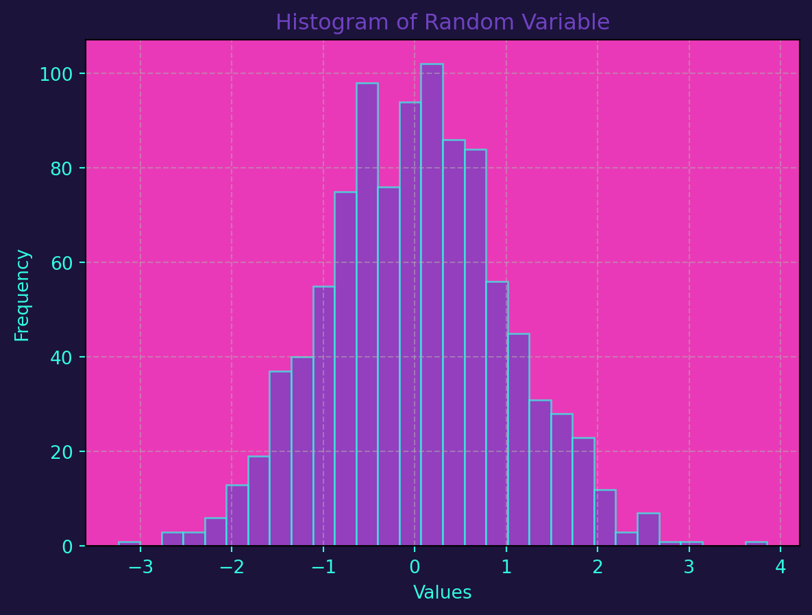
Let’s use Python to create a histogram of a simulated random variable:
import numpy as np

# Sets the seed for the random number generator to 42
np.random.seed(42)
# Generates an array of 1000 random numbers drawn from a normal distribution
# using the random number generated defined above
data = np.random.normal(size=1000)
plot_histograms(data, 'Histogram of Random Variable')
Probability theory and random variables are not just theoretical concepts; they are integral to the practical application of machine learning. Models are built upon the assumptions of probability distributions, and the visualization of data through histograms aids in model interpretation and validation. As you dive deeper into machine learning, a solid understanding of these foundational concepts will empower you to make more informed decisions in model selection, training, and evaluation.
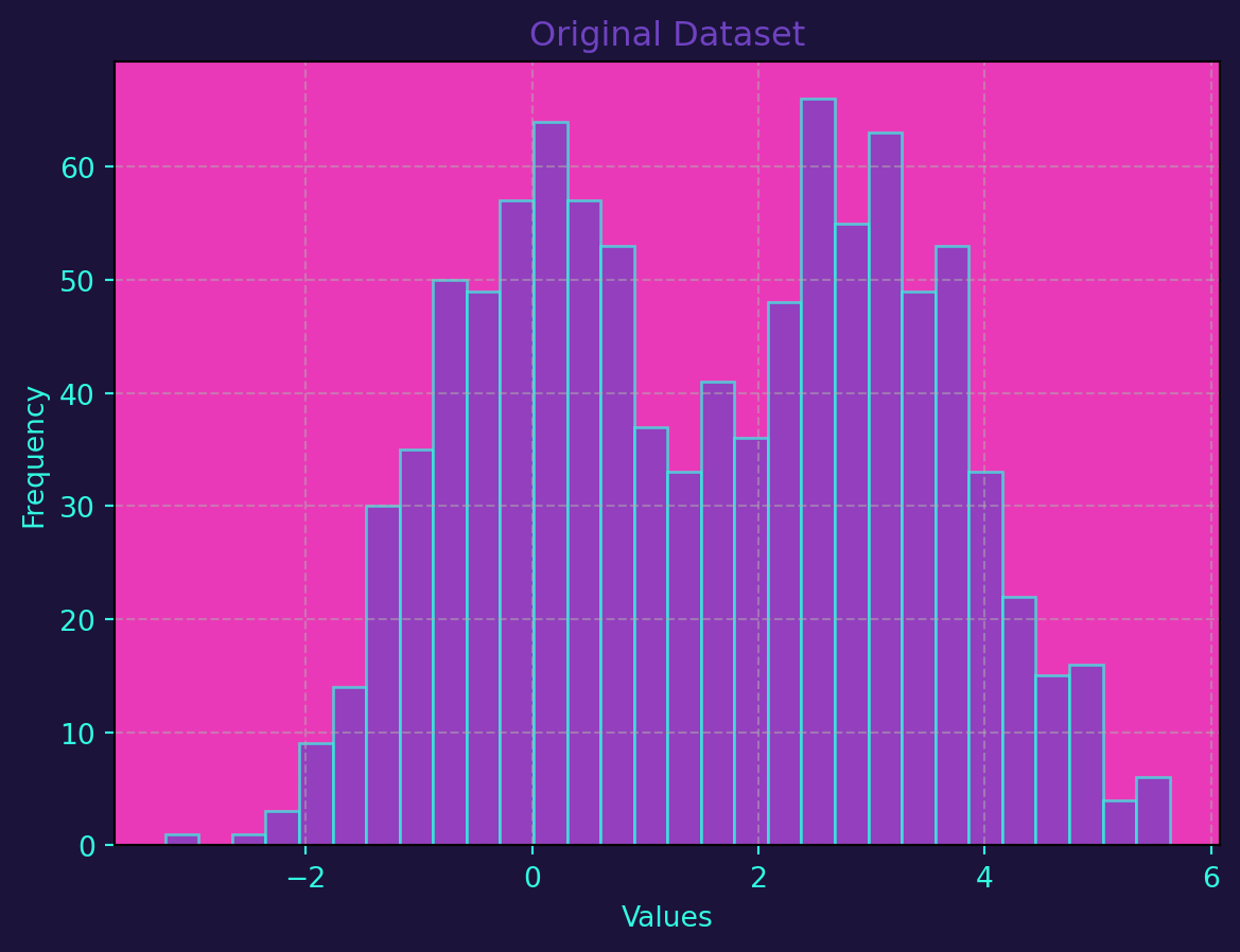
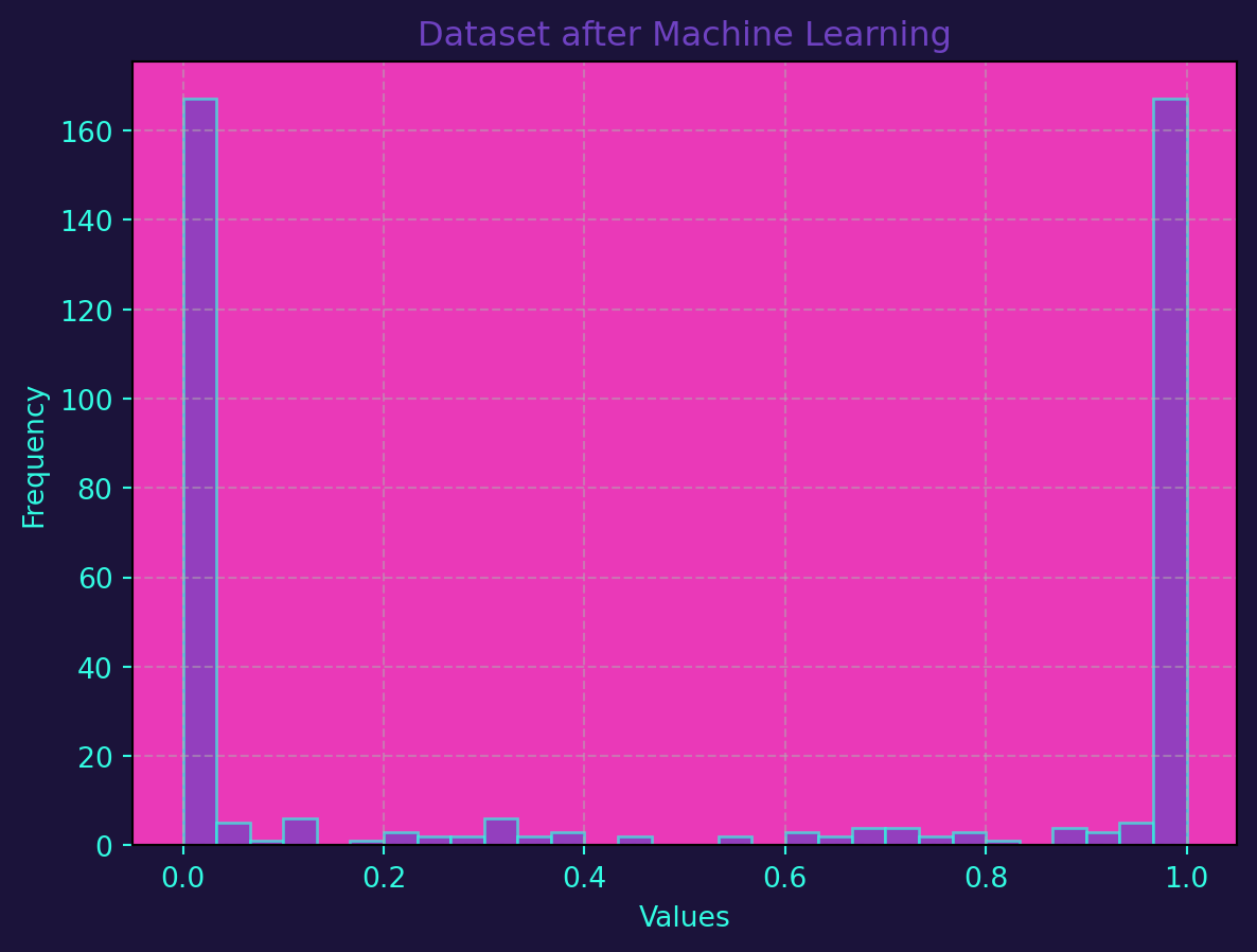
The following code generates a dataset with two classes, trains a Random Forest Classifier on the data, and then generates predictions on a test set. The histograms before and after applying the machine learning model are plotted on top of one another for comparison.
The generate_dataset function creates a synthetic dataset with two classes, and the plot_histograms function is used to visualize the distribution before and after applying the machine learning model. The accuracy of the model is also printed to give an idea of its performance.
from sklearn.model_selection import train_test_split
from sklearn.ensemble import RandomForestClassifier
from sklearn.metrics import accuracy_score

# Function to generate a random dataset with two classes
def generate_dataset(seed=42):
    np.random.seed(seed)
    class1 = np.random.normal(loc=0, scale=1, size=500)
    class2 = np.random.normal(loc=3, scale=1, size=500)
    labels = [0] * 500 + [1] * 500
    data = np.concatenate([class1, class2])
    return data, labels

# Step 1: Generate a random dataset
data_before, labels = generate_dataset()

# Step 2: Split the data into training and testing sets
X_train, X_test, y_train, y_test = train_test_split(data_before.reshape(-1, 1), labels, test_size=0.2, random_state=42)

# Step 3: Train a Random Forest Classifier
clf = RandomForestClassifier(n_estimators=100, random_state=42)
clf.fit(X_train, y_train)

# Step 4: Make predictions on the test set
predictions = clf.predict(X_test)

# Step 5: Assess accuracy
accuracy = accuracy_score(y_test, predictions)
print(f"Accuracy of the model: {accuracy:.2%}")

# Step 6: Generate a dataset after applying the machine learning model
data_after = np.concatenate([clf.predict_proba(X_test)[:, 0], clf.predict_proba(X_test)[:, 1]])

# Step 7: Plot histograms to compare before and after
plot_histograms(data_before, 'Original Dataset')
plot_histograms(data_after, 'Dataset after Machine Learning')
Accuracy of the model: 89.00%
