import numpy as np
from sklearn.cluster import DBSCAN
from sklearn.datasets import make_blobs

# Generate a synthetic dataset
X, _ = make_blobs(n_samples=300, centers=4, cluster_std=0.60, random_state=0)

# Apply DBSCAN
dbscan = DBSCAN(eps=0.3, min_samples=5)
labels = dbscan.fit_predict(X)Introduction
Clustering, a fundamental technique in machine learning, is the process of grouping similar data points together. Its applications are diverse, ranging from customer segmentation in marketing to anomaly detection in cybersecurity. By identifying patterns within datasets, clustering enables us to gain valuable insights and make informed decisions.
Types of Clustering Algorithms
Clustering algorithms come in various flavors, each with its unique approach to grouping data:
K-Means: Divides data into k clusters, where each cluster is represented by its centroid.
Hierarchical Clustering: Forms a tree of clusters, allowing for hierarchical organization.
DBSCAN (Density-Based Spatial Clustering of Applications with Noise): A density-based algorithm that identifies clusters based on the density of data points.
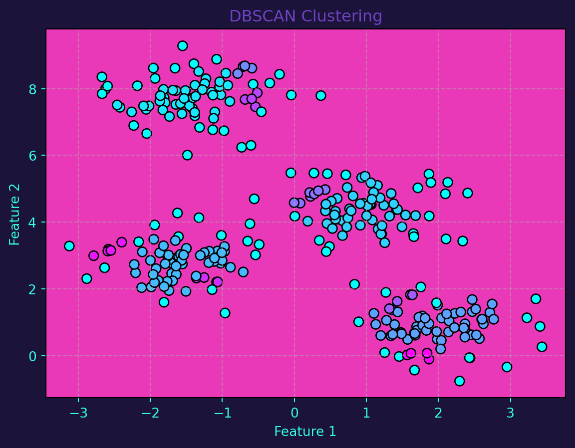
DBSCAN stands out for its ability to discover clusters of arbitrary shapes. The algorithm works by identifying core points, which are densely packed, and expanding clusters by connecting core points. It also identifies noise points that do not belong to any cluster.
Data Visualization
Let’s demonstrate the power of DBSCAN using Python and scikit-learn. We’ll start by generating a synthetic dataset:
I use the following colors in all of my blogs data visualizations
# Define specific colors (same as CSS from quarto vapor theme)
background = '#1b133a'
pink = '#ea39b8'
purple = '#6f42c1'
blue = '#32fbe2'
Visualizing the results of clustering is crucial for understanding the underlying structure of the data. Let’s create a scatter plot that represents the original data points with cluster labels:
import matplotlib.pyplot as plt

# Visualize the clustering
fig, ax = plt.subplots()
scatter = ax.scatter(X[:, 0], X[:, 1], c=labels, cmap=plt.cm.cool, edgecolor='black', s=50)
ax.set_title('DBSCAN Clustering', color=purple)
ax.set_xlabel('Feature 1', color=blue)
ax.set_ylabel('Feature 2', color=blue)
ax.grid(True, linestyle='--', alpha=0.5)
ax.tick_params(axis='x', colors=blue)
ax.tick_params(axis='y', colors=blue)
ax.set_facecolor(pink)
fig.set_facecolor(background)
plt.show()
Clustering, especially with the powerful DBSCAN algorithm, opens new avenues for extracting patterns from data. As we’ve seen, DBSCAN’s ability to identify clusters based on density makes it versatile for a wide range of applications. By visualizing the results, we gain a deeper understanding of the data’s inherent structure, providing a solid foundation for subsequent analysis and decision-making.